

The web was built for desktop computers. Over the last several years, smartphones and tablets are becoming the preferred choice for Internet access, and not just for me. The PewResearchCenter shows that cell phone, e-Book reader and tablet sales are up while desktop computer sales are down:
- 56% of adults own a smartphone (80% ownership of ages 18-29)
- 55% of adult cell owners use the internet on their mobile phones
- 34% of adults own a tablet
Here’s more data showing the mobile revolution has begun.
One change in the way people make websites is the mobile-first approach which will:
- Prepare you for the explosive growth and new opportunities emerging on mobile today
- Force you to focus and prioritize your products by embracing the constraints inherent in mobile design
- Allow you to deliver innovative experiences and modes of use
This can be done through mobile apps, mobile sites and responsive web design.
Mobile Apps
Before I discuss the mobile web further, I want to mention mobile apps. There are great reasons for doing both. Mobile apps have access to system resources and hardware features that the web does not, as well as the ability to sell the app through the platform’s online store. So if you require this deeper access or sales opportunities, you might need a native app. However, that doesn’t mean you don’t need a mobile web solution.
The references I share in this post are done with links, which don’t open apps, they open a web browser. Users share links through email, social networks, or on web pages. If you don’t have a mobile site that contains these links, your users won’t have a great experience. To reach these users with a native app requires building and maintaining for multiple platforms, specifically iOS and Android. Twitter and Facebook users rely on the mobile web much more than mobile apps.
A mobile site is easier to maintain, faster to update and far less expensive overall.
An alternative way to develop mobile apps is PhoneGap; an open-source framework acquired by Adobe in 2011. PhoneGap wraps your website or web application into a native app for delivery on all mobile platforms (iOS, Android, Windows, Blackberry, WebOS and Symbian). This means that your web app will have access to many native phone features and made available for download from the respective app stores. The major benefit of PhoneGap is that the development cost is much less than in building a native app for each mobile platform. One code base of HTML, CSS and JavaScript is deployed to all devices packed in a native app wrapper.
Mobile Sites
Some companies utilize a traditional desktop site along with a mobile site. A mobile site has far less screen real estate than a desktop site. The constraints this introduces means that all of the unnecessary links, ads, text, images and more must be moved or removed. Adding content to a website is relatively easy, so stakeholders usually want to add as much as possible to their home page. By forcing the removal of this useless content, you are required to focus on what really matters most to your users.
Here are a few mobile site examples:
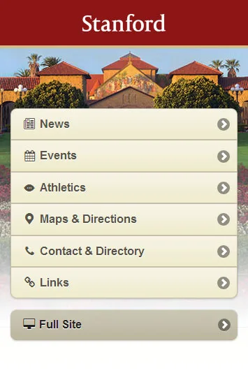
Stanford

Southwest
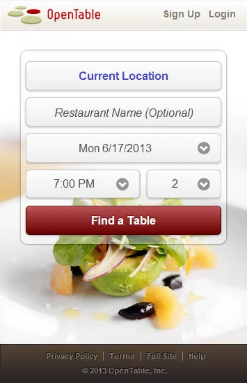
Open Table
Responsive Web Design
If you would like one site that works on mobile, tablets and desktops then responsive web design is your answer. This approach will allow your site to adjust to the size of the device it’s being displayed on. This is the latest evolution in the mobile web.
Time redesigned their site as fully responsive. Here’s how it looks on different devices:
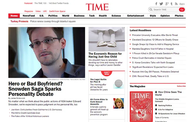
Desktop

iPad

iPhone
Here are other great responsive examples; notice how the site changes layout and responds to different browser widths:
Mobile apps, mobile sites and responsive web design are all strong options for you to consider. As with anything, it comes down to what makes most sense for your users. Contact SOLTECH today to learn more about custom development for mobile apps, mobile sites, and responsive web design.
Now, if you’ll excuse me, I just got an email on my phone.